8 Ways to Install Shiplap in a Kitchen
July 1, 2021
By: The Finished Space
The design world has rightfully been obsessed with shiplap for a while, and we don’t blame them. Pair shiplap with industrial fixtures, Scandinavian styling, contemporary furniture, or a farmhouse aesthetic – no matter what you decide to do, it just works!
One of the best places to add shiplap? The kitchen! It’s a simple, versatile, and unobtrusive way to add rustic style to any modern interior design. Need some proof? Here are eight ways to install shiplap that will completely transform your kitchen:
1. Cover the Ceiling
Source: https://www.instagram.com/kpetersondesign/?utm_source=ig_embed
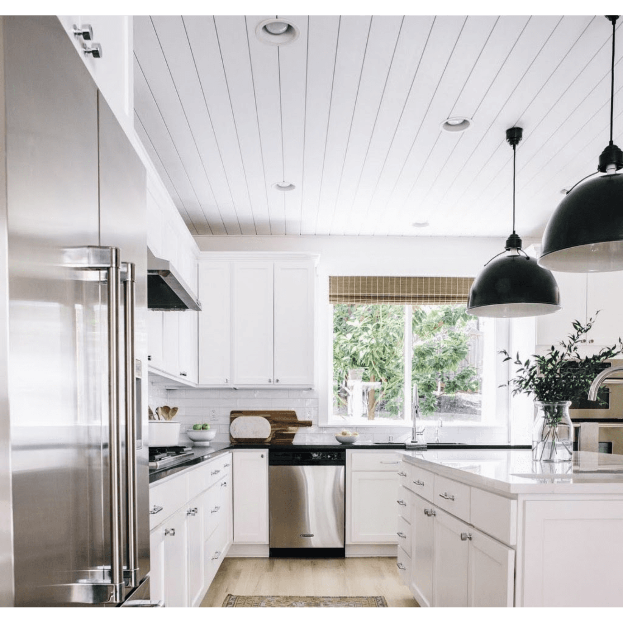
There’s no reason to keep your ceilings plain and boring. Why not elevate your design by covering them with shiplap? It’s the perfect companion to this black and white, industrial-inspired kitchen.
While you’re at it, liven up your shiplap ceiling with recessed lights and plenty of sunlight. Paired with black bucket lights, black countertops, and chrome appliances, you simply can’t go wrong. This kitchen is a rare and outstanding example of shiplap serving as a complementary component rather than the star of the show.
2. Wrap the Exhaust Hood
Source: https://kowalske.com/whats-shiplap/
An exhaust hood (also called a kitchen hood or range hood) is a necessary part of every kitchen that displaces smoke and other cooking fumes, so you don’t have to breathe them in. Most people leave their hoods bare, but it’s not a requirement! In fact, unless it matches your aesthetic, you should try to liven it up a bit.
Wrapping your hood in shiplap is an excellent way to add personality and texture to an often-overlooked part of the kitchen. Plus, if you’re really looking to capitalize on that rustic farmhouse vibe, add some trim made from distressed wood.
3. Accentuate Countertops
Source: https://nateberkus.com/
As illustrated in this super modern kitchen design, you can use shiplap to really accentuate your polished countertops. This is an exceptional use of shiplap because it pairs so well with the natural, warm light and vibrant plant life.
Everything from the wicker lamp to the lamb poking its little head in, is absolutely perfect. We also can’t get enough of that beautiful vase and stone tray. This designer has a keen eye for style and comfort.
4. Create a Cute Breakfast Nook
What’s the best part of your morning? There’s nothing quite as delightful as a cozy little breakfast nook.
The shiplap here is used in such a thoughtful and decisive way. It serves as a backdrop for the entire nook, highlighting the wood grain beam and vintage furniture.
5. Transform Your Kitchen Island
Kitchen islands always look amazing, but most people focus their attention on the top and forget that they can do something with the bottom. This use of shiplap is clever because it adds a ton of rustic personality and lively texture without pulling too much focus.
Also, notice that there are two visible electrical outlets on this side of the island. Just because you use shiplap doesn’t mean you have to skimp on practicality. This would be a perfect place to work from home or for the kids to plug in their laptops and do homework after school.
6. Shiplap Chair Lines
Source: https://designingidea.com/shiplap-kitchen/
Yet again, we’ve uncovered another use of shiplap that doesn’t dominate the design aesthetic. Chair lines are an excellent way to add dimensionality to your walls. It splits them in half, making them seem more dynamic.
The dimensionality multiplies tenfold with the use of shiplap. As a result, this entire kitchen feels stylish, comfortable, and chic. The matching white cabinets and the splash of blue in the brick-like backsplash bring the entire look together.
7. Walls, Walls, Walls!
Source: https://www.southernliving.com/home-garden/decorating/shiplap-ideas Photo Credit: Christopher Shane
Some people like to use restraint when it comes to shiplap because it can be really bold. Designers often use it for a single piece or a highlight wall. As you can see here, that’s not always necessary.
In fact, the shiplap in this kitchen is installed so cleanly that it creates an incredibly calming and peaceful environment. Using a beautiful blue in the cabinets with a pop of natural wood grain on the island makes this the chef’s kiss of shiplap utilization.
8. Floor to Ceiling
This is another excellent example of how “too much” is just a matter of perspective. Instead of the typical white canvas that most designers utilize, what we see here is a canvas made entirely of shiplap.
An even bigger surprise? The shiplap isn’t painted! It’s so refreshing to see it in a beautiful, natural wood grain. Everything from the lights and furniture, to the island and cabinetry, makes this a stunning kitchen design that any designer would proudly call their own.
Get the Best Shiplap With Metrie
Are you looking for more shiplap-compatible kitchen designs that fit your design aesthetic? Take a look at our inspiration galleries. There are lots of fun ideas to help get those creative juices flowing.
If you’d like to get a better understanding of your own aesthetic, you should check out Option {M}. It’s a great way to help you identify your ideal interior design style.

